Every day, we are bombarded by visually stunning infographics about virtually every subject. Data visualizations help people digest large chunks of info and have strong viral potential on social media channels like Twitter and Facebook, so they have skyrocketed in popularity in recent years. There are infographics about water, the Civil War, web usage, bankruptcies, the Boston Celtics, the credibility of news sources, and even video versions about the credit crisis of 2008-2009. There is even a website dedicated to publishing a daily infographic.
When it comes to the American Revolution, I found one about logistics and several creative timelines, such as this impressive interactive one by the American Revolution Center. However, it seems like there is a shortage of infographics about the Revolution. History books are loaded with simple charts and graphs, but few stretch creative boundaries like the ones shared above. My fingers are crossed that the forthcoming 250-year anniversaries of Revolution-era events will produce a surplus of creative Revolutionary War data interpretations.
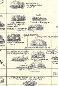
By far, the most impressive information design I’ve seen about the Revolutionary War is also quite scarce. It was drawn and engraved in 1871 by John W. Barber; titled “The Eight Years of the War of the American Revolution: Chronological Table of the American Revolution.” It’s described as “showing the time and place of each event: with a list of the Signers of the Declaration of Independence, arranged in the limits of the Thirteen Original States they represented.” The stunning American Revolution data visualization also features a dotted line tracing the route of Washington as Commander. I have never come across this particular infographic in any of my 500+ books and magazines about the Revolution, but was able to purchase an original 1871 print, so readers of the Journal of the American Revolution can now be treated to a scarce piece of history. Enjoy!


3 Comments
This is a fantastic find. As a designer by trade and Rev War enthusiast, this is definitely going on my wall.
Todd – this 1871 John W. Barber Revolutionary War pictograph timeline is tremendous!
Thanks for sharing the link above with all the readers!